Account Enhancement
The Merge and Group Assignments buttons were combined into a single button on the Account List to make it easier to use.


An Income Verification Trend graph was added to accounts. By clicking on the Income Verification, the trend graph will display along with the details.

Enhancement to Account Goals
A sort order has been added to Account Goals. Leaving the sort order blank will automatically place the goal at the end of the list.
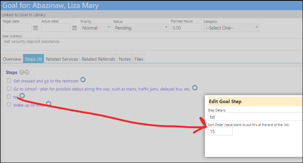
The same is true for the goal library (configuration > reference libraries > client goal library).
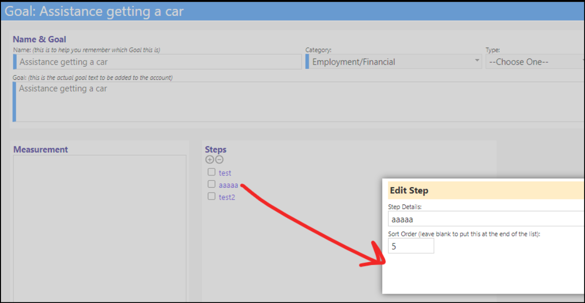
Creating a goal for an account by using a goal from the library will carry over the same sort order from the library.
Appointment Calendar Print Fix
On the printing of some Appointment Calendars, users may find part of the calendar getting cut off, for example...Saturday might be partially cut off. A fix was implemented to adjust the screen for calendar print and pdfs. Administrators can adjust the Calendar Print Zoom setting in Configuration Options to correct this issue. A setting of 75 is typical.
NOTE: This does not work for all screen resolutions and sizes. It works for many - but for some screens and printers, admins may need to adjust the printout SCALE to get it to fit.

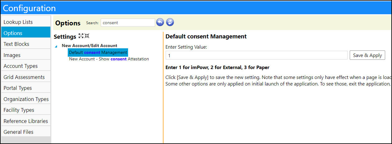
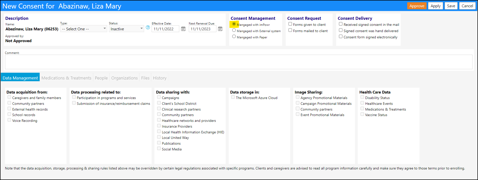
A new Default Account Consent Management setting can be found in the Configuration Options. Any setting other than a 1 in that field, will be treated as a 1 - imPowr.
Appointment Enhancements
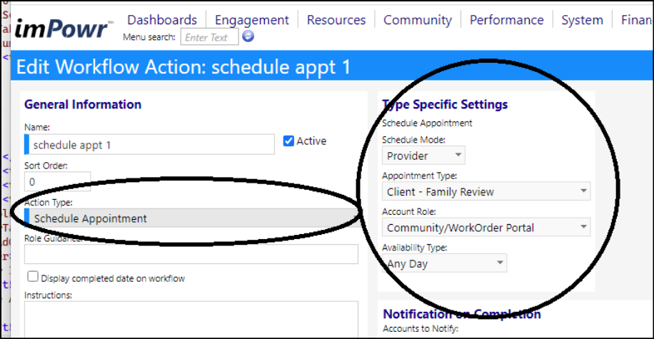
A scheduling lego is now available in Program Workflows for PROVIDERS scheduling only.
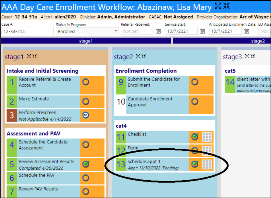
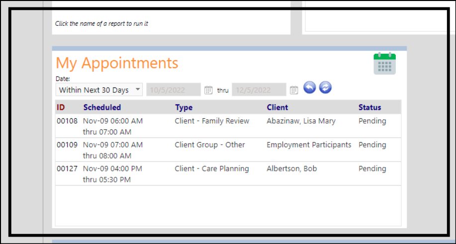
The scheduled appointments will display in a new My Appointments panel on the Provider's My Dashboard page.
Clicking on the calendar link in the My Appointments panel redirects the user to a My Appointments Calendar.
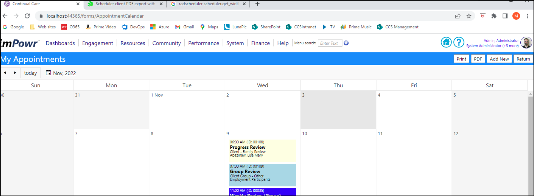
New printout options are available for the My Appointments Calendar.

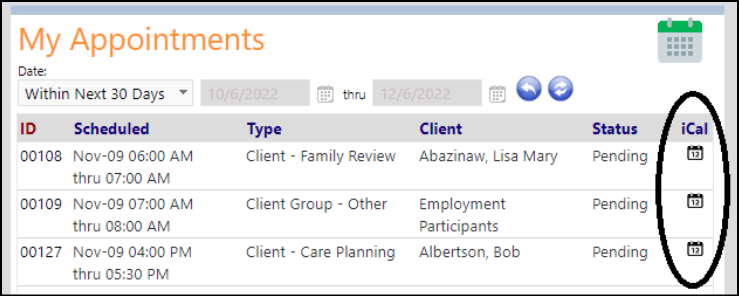
Users have the ability to export their appointments to their meeting calendars, such as Outlook.
From the Appointments List:

From the My Appointments panel:
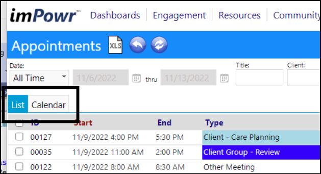
Users can toggle the Appointments List between List mode or Calendar mode.
An Outlook export button was added to the Provider Portal for provider availability.
On the grid:

On the calendar:

In the Appointment details screen, users can choose to Produce the Client Letter by clicking on the More drop-down button.


Sometimes we generate letters and schedule appointments "today", but we don't have the client contact info until the next day. So we don't print the letters until the next day after the client content has been refreshed.
A new feature allows us to handle that situation.
When an item is sent to the document queue, it can be sent "as is" or as a "template". Users can select that option when sending to the queue from the workflow letter screen, when they click on "Complete Step".
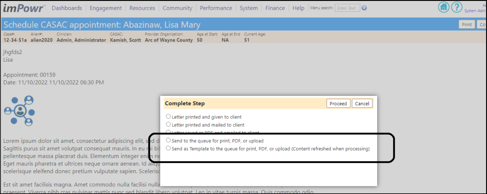
On the queue screen, users will see that choice as shown below.
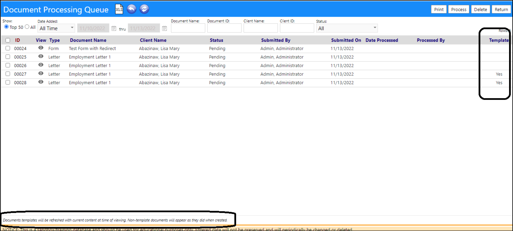
When the letter is previewed, if it was saved "as is" (not a template) the letter will appear with reserved words filled in as it looked when it was created. If it was saved as a template, the reserved words will refresh to their current values at time of viewing.

Enhancement to Care Manager Portal
A Flag for Discussion link has been placed on the care manager summary page. The functionality of this link is almost identical to the version on the provider summary. Now, users will have to select who to send the message to (instead of it defaulting to the CASAC), as well as the method for sending the message.
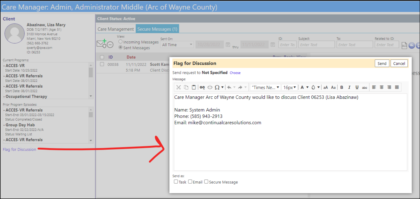
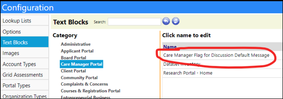
The default message used is setup in Configuration Text Blocks:
Case Audits Enhancement
The summary tab on the Case Audit Question-Based Findings page is now filled in with several options that are derived from the section based findings page, and a few new ones
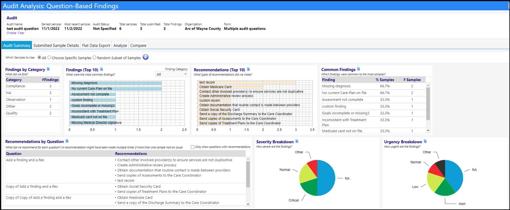
A selector for samples ('Which Samples to Use') has been added to the top of the Audit Summary screen.
- The selector defaults to all samples, which will pull data from all submitted samples in the current audit.
- The second option will provide the user with a dropdown list from which they can choose specific samples from the list of submitted samples.
- The third option will allow the user to choose a specific number or percentage of samples, and each time they refresh, it'll provide a random selection of submitted samples.
In the following example, each time the screen is refreshed, it'll use a random 10% of submitted samples from the case audit currently being viewed.

There is also a new "go to" icon on each chart. Clicking on the icon will open up a report on the flat data export tab displaying a more "full" version of the data on that chart.

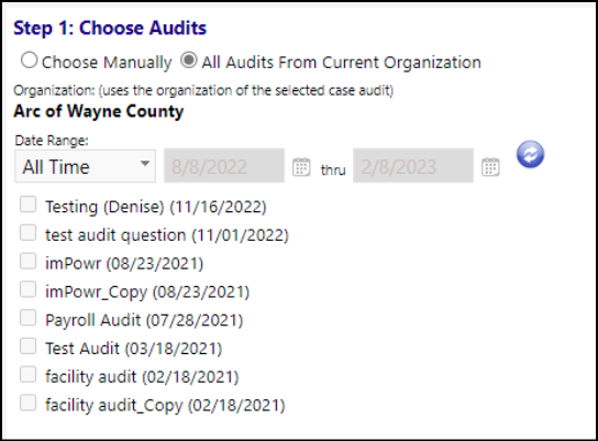
A new Compare tab has been added to the Case Audit Question-Based Findings page. This tab consists of 3 steps - the first lets the user choose which audits they want to compare together and what data they want to get from them.

Users can choose the list of audits to compare manually, or pull in every audit for the same organization as their selected audit at the top of the page. When filtering by organization, the date filter works based off of the case audit date (so users can do something like only compare every Q4 2022 audit for X organization)
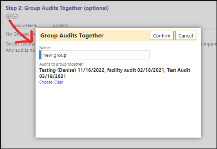
The second step allows the user to group audits together. Multiple audits grouped together will show as a single data point on the graphs and charts later.
- NOTE: Any time a change is desired for the list of audits in step 1, the list of groups will reset, so only create a list of groups once you're satisfied with the list of audits.
Step 3 displays the charts the user wants to see. Clicking the compare button in step 3 will display the results.
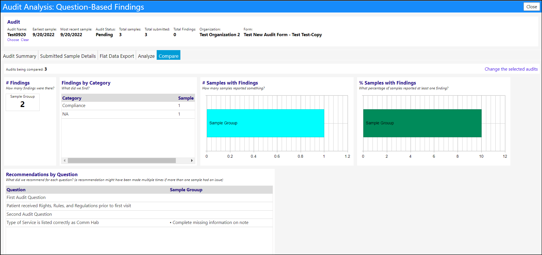
Use the link button in the top right to go back to the original screen and modify your selections.
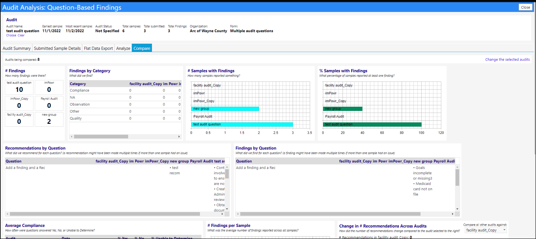
A new Question-Based Findings: Analysis Builder has been added to Case Audits. The purpose of this page is to give the user a sandbox to slice and analyze the data from one or multiple case audits.
In order to access this Analysis Builder, a new security privilege will be required.
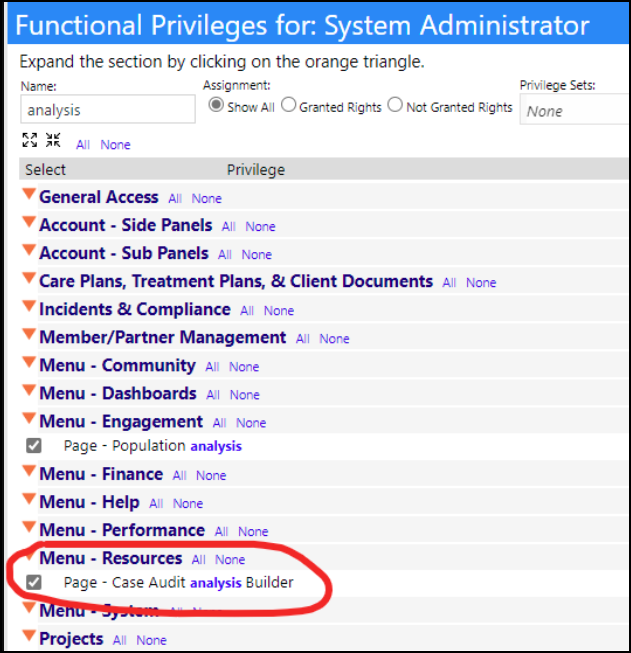
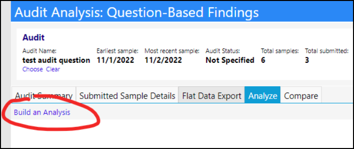
On the Question-Based Findings page, users can find a link to build an analysis. A case audit must be selected on this page for the link to show, even if the user has the security privilege selected in their account role.
This page lets users 'play around' with the data in one or multiple related case audits, to find trends and create exports. There's a lot this can do, so the real value will come from working with it for a bit to find trends and insights in data. As an example, the following image displays the number of findings in each sample within all 2022 test audits from and organization in our test environment.
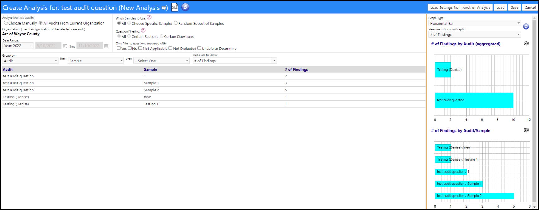
The filters up top are split into three sections. The top left section lets you bring in data from multiple audits, either by choosing multiple audits manually, or by bringing in all audits for the current organization within a date range. (The current organization is defined as the organization attached to the main case audit, which the main case audit is named on the top of the page. The case audit which was selected when the Build Analysis was clicked is the "main" case audit that all of this analysis is built upon. The top right section has optional filters based on samples, questions, and responses. Some selections here will be disabled when bringing in multiple forms. Hover over the ? icons as they appear, and they'll identify why things are disabled. Lastly, the bottom section of filters controls the grouping and the measures. The first level of grouping must always be selected (there is no way to have it not selected), but the second and third levels are optional. The dropdown list of measures to show controls additional columns, like # findings, # recommendations, % yes/no/etc.
The graphs on the right side of the page update each time the grid is refreshed. There will be a number of graphs equal to how many levels of grouping you are using. Since in the above screenshot, the results were grouped by audit, and then by sample, because that's two levels of grouping, two graphs will be displayed. The bottom graph will always just show the data in the grid, but in graph form. Every graph above the bottom graph will aggregate the data to the next-highest grouping criteria. In the screen capture, the bottom graph counts findings by audit then sample, and the upper graph just counts findings by audit. If multiple measures to show were selected, users will have to choose just one to put in the graphs using the dropdown list at the top of the graph section. There's also an option to choose graph type, like pie charts, line graphs, etc.
The full implementation of this Analysis Builder is still under contruction.
After building an analysis, there is now a way to be able to save it to the database, so it can loaded at a later time and the data can be displayed in a more user-friendly way.
The button near the analysis name now lets users edit the analysis name and description
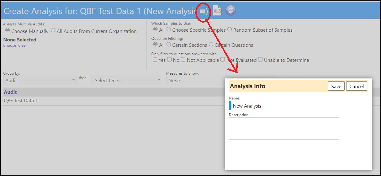
The "Save" and "Save New" buttons lets users save their analysis and all the associated settings to the database. When the analysis is new and has never been saved before, both these buttons do the same thing. But once an existing analysis is being edited, the save button just updates the existing analysis, while the save new button will save everything as a new analysis. Essentially it's the same idea as "save" and "save as" in software programs like Microsoft Word or Microsoft Excel.

'Load' lets users load an analysis from the database. Doing this will remove any unsaved changes the user has made to the page. Since analyses are tied to case audits, users will need to choose a case audit first, then choose one of its analyses. This popup window defaults to the currently selected case audit when first opening it to make that a bit easier. There is also a red X icon that appears next to the dropdown list - this lets users delete an analysis. Clicking 'Proceed' instead will load that analysis and will refresh the page

Similarly, the "load settings from another analysis" button works like the load button - it only loads the settings from a chosen analysis, but lets the user keep editing whatever analysis had already been opened. This is helpful if, for example, a user has an analysis for all Q3 audits and wants to duplicate the same analysis for all Q4 audits. They could start a new analysis, load the settings from their Q3 analysis, select all their Q4 audits with those settings, and then they've essentially copied that analysis for a different subset of audits.

Lastly, the new analysis button just erases out all submitted changes and lets the user start on a new analysis
The analyze tab has been changed slightly - it now displays like this when first loaded:

If the user had saved an analysis, it'll display on that dropdown list upon selection. If the analysis was set up to use all case audits from an organization, the user will also get a date range that can be filtered on. The analysis description (if one exists) will also display above the grid.
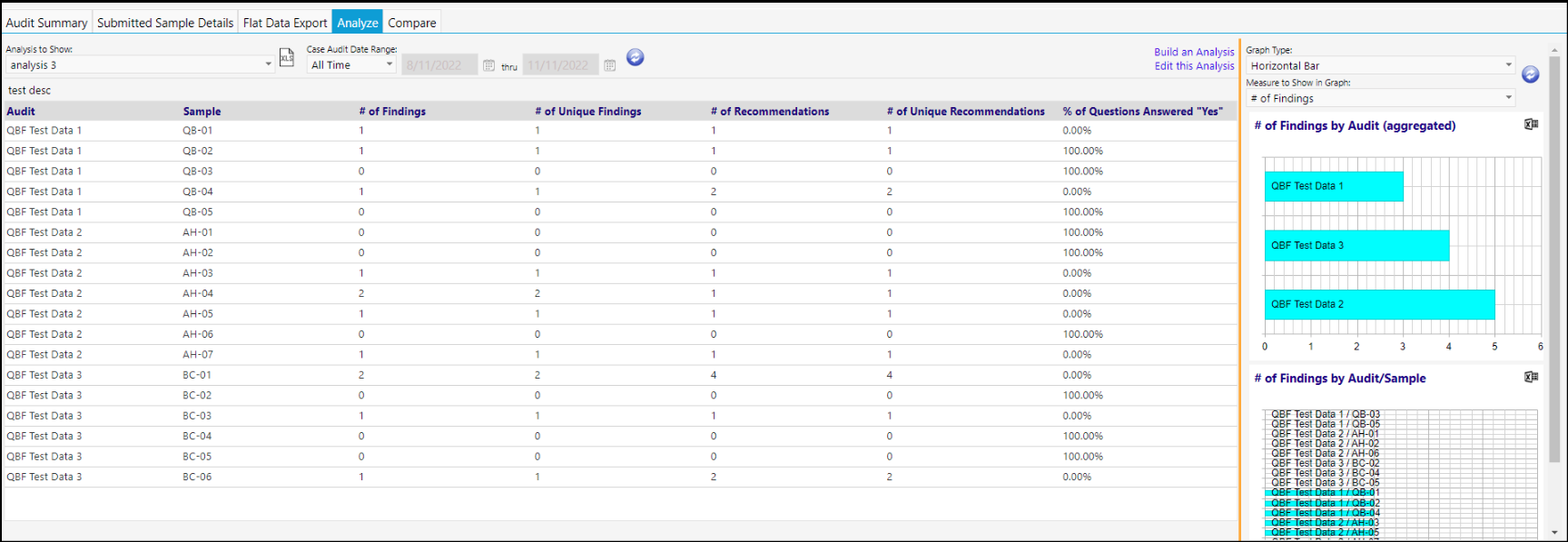
From here users can export the main grid or any of the graphs, by clicking on the export icon or the individual export icons at each graph.
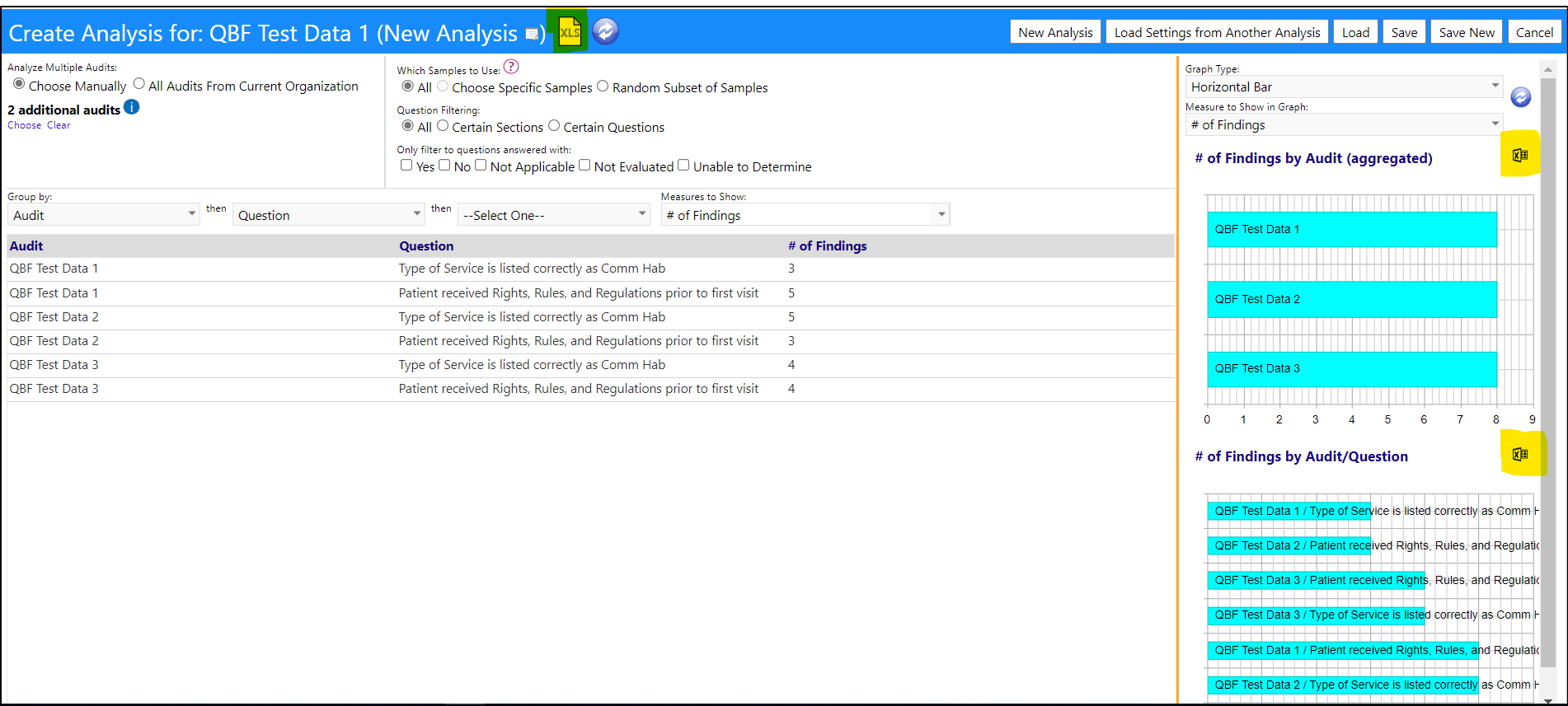
There is also an "edit analysis" button that will bring the user to the edit page and immediately load up the current analysis if the user has the appropriate security privileges.

Additionally, a seed field for an analysis has been added. This field only applies if the user has selected a random subset of samples. It allows the user to get the same random list of samples each time the screen is refreshed. Clicking on the question mark icon to the right of the seed field which displays, when the Random sample button has been selected, will display a tooltip that explains what the seed is for those who aren't familiar with it.

Dashboard Date Range Default Enhancement
A new configuration page for dashboard date range settings has been created.
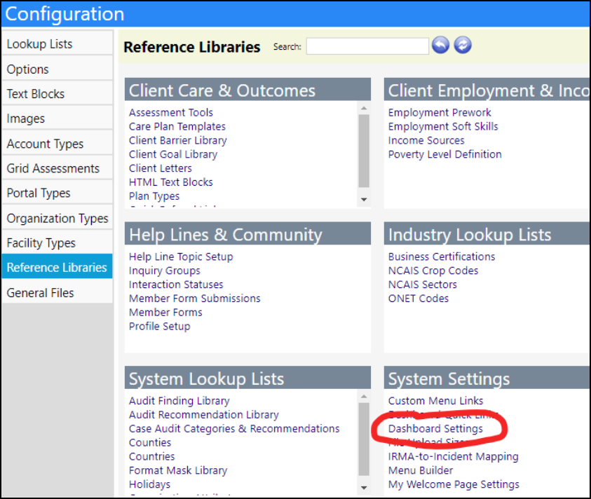
This configuration setting lets users set a default date range for each dashboard. When any user logs in with a new session and goes to a dashboard, the date range will populate by default to whatever you define in the settings. All dashboards default to "past month", which is how they have always worked. Once a user is on the dashboard itself, whatever the date filter is set to, will save to their session, so next time they go to the same dashboard, it'll keep the date filter they had defined instead of resetting to the default value.

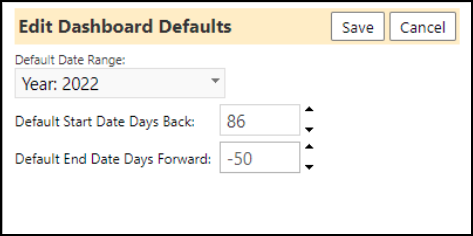
The session persists beyond just logging out and logging back in. From the server's perspective, the moment someone visits imPowr, they are provided with a session (even before they log in). That session will be the same unless they don't interact with imPowr at all for about two hours. The session stores things like the application settings and the values the user set filters to, which is why it remains even after logging out.
Enhancement to Forms
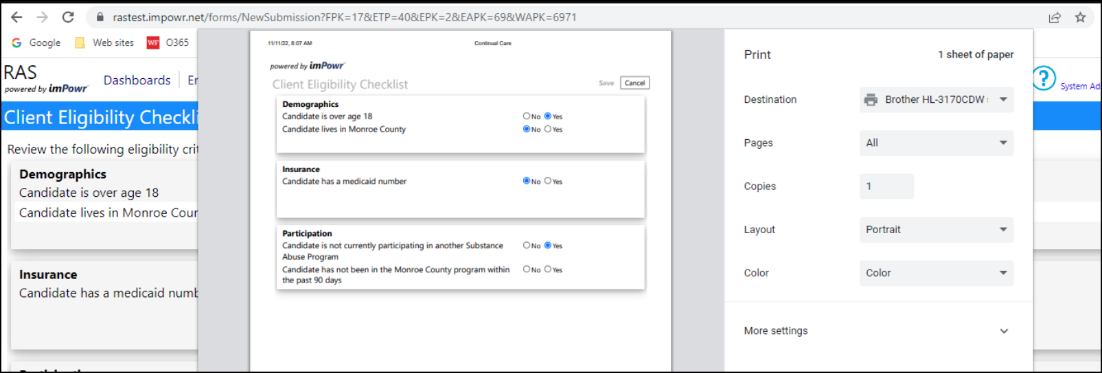
A new Print button was added directly to the Form to make it easier to intiate a Browser Print of the page.

Example: Client Eligibility Checklist:
A Header Block has been added to Client forms, to capture basic client information directly on the form.

New Program Bulk Operations
Bulk Operations have been added to Programs allowing users to update Account Programs in bulk. When the Bulk Operations button is pressed, users can choose between doing the following in bulk:
- Add Plan Types
- Send Email
- Update Status
- Assign Program Case Manager
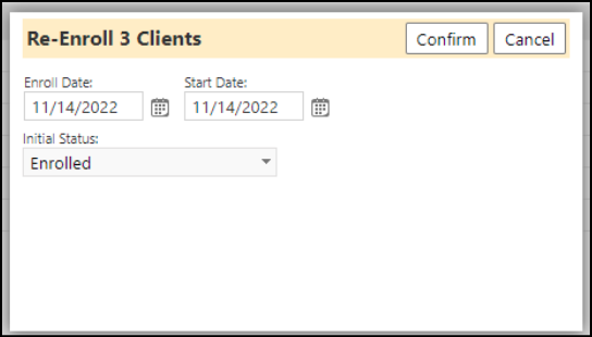
- Bulk Re-Enroll

The process involves choosing any clients in the program, then choosing the Bulk Operation to set the option. Once the Confirm button is clicked the build operation will be complete.
Program Workflow Enhancements
Once entered onto a Program Workflow Action Step, users have been able to display the Instructions by hovering their mouse over that step.
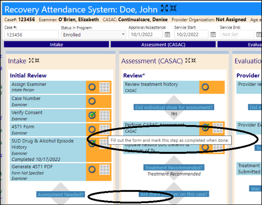
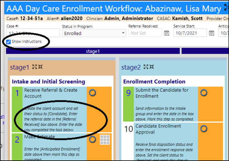
A change has been made which allows users to choose whether to display instructions instructions in more a persistent way. By selecting the 'Show Instructions' checkbox, the user can always display the instructions in the workflow.
A new widget has been added that allows a user to view another page, directly from the workflow. By creating a "View Page" Action, users can specify which page they would like to view for that account program.
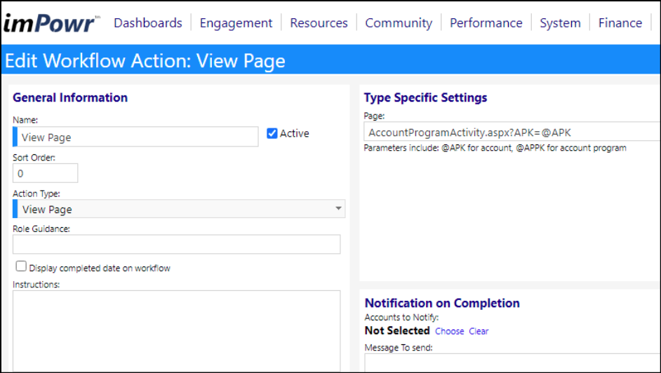
In the following example, the entry of the page 'AccountProgramActivity.aspx' designates the Account Program Activity page. The designation of '?APK=@APK' along with the page causes the system to show that page for the selected individual (based on the pKey (or Primary Key) for that account - in imPowr, that is the Account ID). For example, if this workflow was accessed from the Account Programs for account 6253 (in the test system) for Lisa Mary Abazinaw, when this widget was selected in the workflow, the user would be brought to the following page:

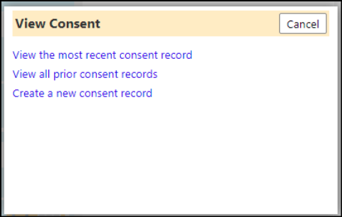
On a Program workflow, when a user selects a widget with a Client Consent Action, they now are presented with multiple options to choose from:
Enhancement to Task Related Scheduled Notifications
Because of HIPAA, imPowr is unable to display protected information like names, etc. A change was made to include links in notifications so users can quickly see those details instead of having to manually go to the task list and searching for the task.
The notification now includes that link:
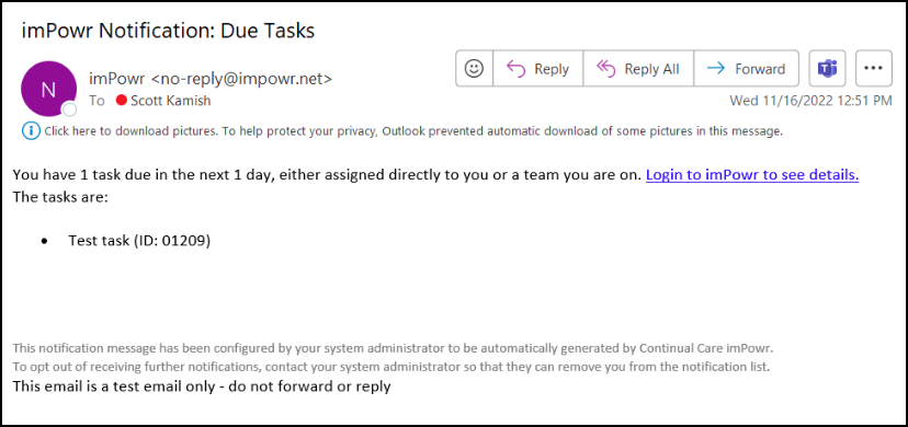
Clicking on the link brings the user directly to the task list, filtered for the task:
